Case Study
Manal’s Bouquet
Project Overview
The Problem.
Manal’s Bouquet has identified lack of knowledge using phone delivery service and understanding personal needs to create better service.Responsibilities.
Conducting interviews, paper and digital wireframing, low and high-fidelity prototyping, conducting usability studies, accounting for accessibility, iterating on designs, determining information architecture, and responsive design.
Role.
UX designer leading the app and responsive website design from conception to delivery.
The Product.
Manal’s Bouquets is focused on delivering better service for all occasions. It is an organization that helps meet the needs of the consumers and provides service to the community. Manal’s Bouquet targets all users including college students.
The Goal.
We wanted to design an app that will improve and provide better service for consumers that wants fast delivery and better service.June, 2021 to November, 2021
Project Duration.
June, 2021 to November, 2021
Understanding the user.
I used Manal’s Bouquet to develop interview questions, which were then used to conduct user interviews. The feedback received through
research made it very clear that users needed floral service that provides faster delivery, easy access to navigate and consistency.
User pain points.
Experience:
Online floral websites don’t provide an engaging browsing experience
Navigation:
Floral website designs are often busy, which results in confusing navigation
Interaction:
Small buttons on floral websites make item selection difficult, which sometimes leads users to make mistakes
Persona & problem Statement.
“I am looking for a reliable App for my planning event that will deliver floral arrangements quick and on the go”
Competitive Audit.
An audit of a few competitor’s products provided direction on gaps and opportunities to address with the Manal’s Bouquet.
Ideation & Wireframes.
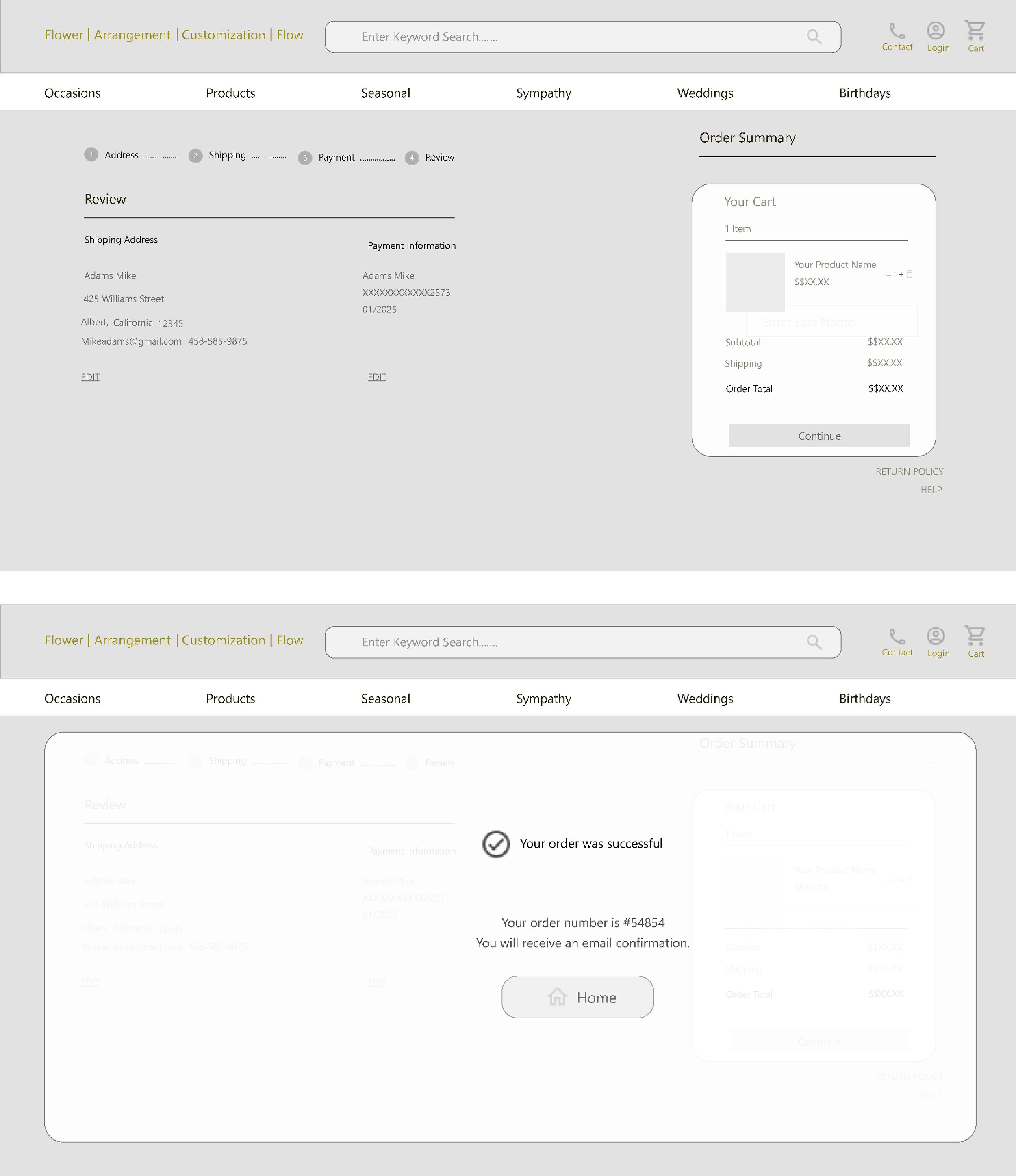
Next, I sketched out paper wireframes for each screen in my app, keeping the user pain points about navigation, browsing experience easier. The home screen paper wireframe variations below focus on optimizing the browsing experience for users. I started to work on designs for additional screen sizes to make sure the site would be fully responsive. My focus was fast order and good experience checkout.
Digital Wireframes.
After ideating and drafting some paper wireframes, I created the initial designs for Manal’s Bouquet app. These designs focused on delivering better services to consumers. Prioritizing useful button locations and visual element placement on the home page was a key part of my strategy.
Usability study findings.
To prepare for testing, I created a low-fidelity prototype which you can view here. I used this prototype to conduct an unmoderated usability study with 7 participants. Here are the main findings uncovered by the usability study:
Navigation:
People want easy access to the App that is less complicated
Faster Delivery:
People had difficulty for faster delivery
Better Visual:
The visual wasn’t more appealing and not a good flow
Refining the design.
Mockups
Based on the insights from the usability study, I applied design changes by providing high quality colors, better visual and fonts that is easy to navigate.
Accessibility considerations.
1. Headings
I used headings with different sized text for clear visual hierarchy
2. Landmarks
I used landmarks to help users navigate the site, including users who rely on assistive technologies
Refined designs.
Responsive design.
Site Map
With the app designs completed, I started to work on designing the responsive website. I used Manal’s Bouquet sitemap to guide the organizational structure of each screen’s design to ensure a cohesive and consistent experience across devices.
Screen size variations.
The designs for screen size variation included mobile, laptop and desktop. I optimized the designs to fit specific user needs of each device and screen size.
Going Forward.
Takeaway
Impact.
Users shared the app made Manal’s Bouquet is something that could help meet the consumers needs in order to make fast order and being able to help their clients.
What I learned.
I learned that even though designing a website for all inclusions, it is good to have something that is easy to navigate with high contrast for better visual.
Next Steps.
Identify any additional areas of need and ideate on new features. Create another high fidelity Proto type to test more complex design App.
Conduct follow up user testing on website flow.
Introduce graphic illustration for user journey.


